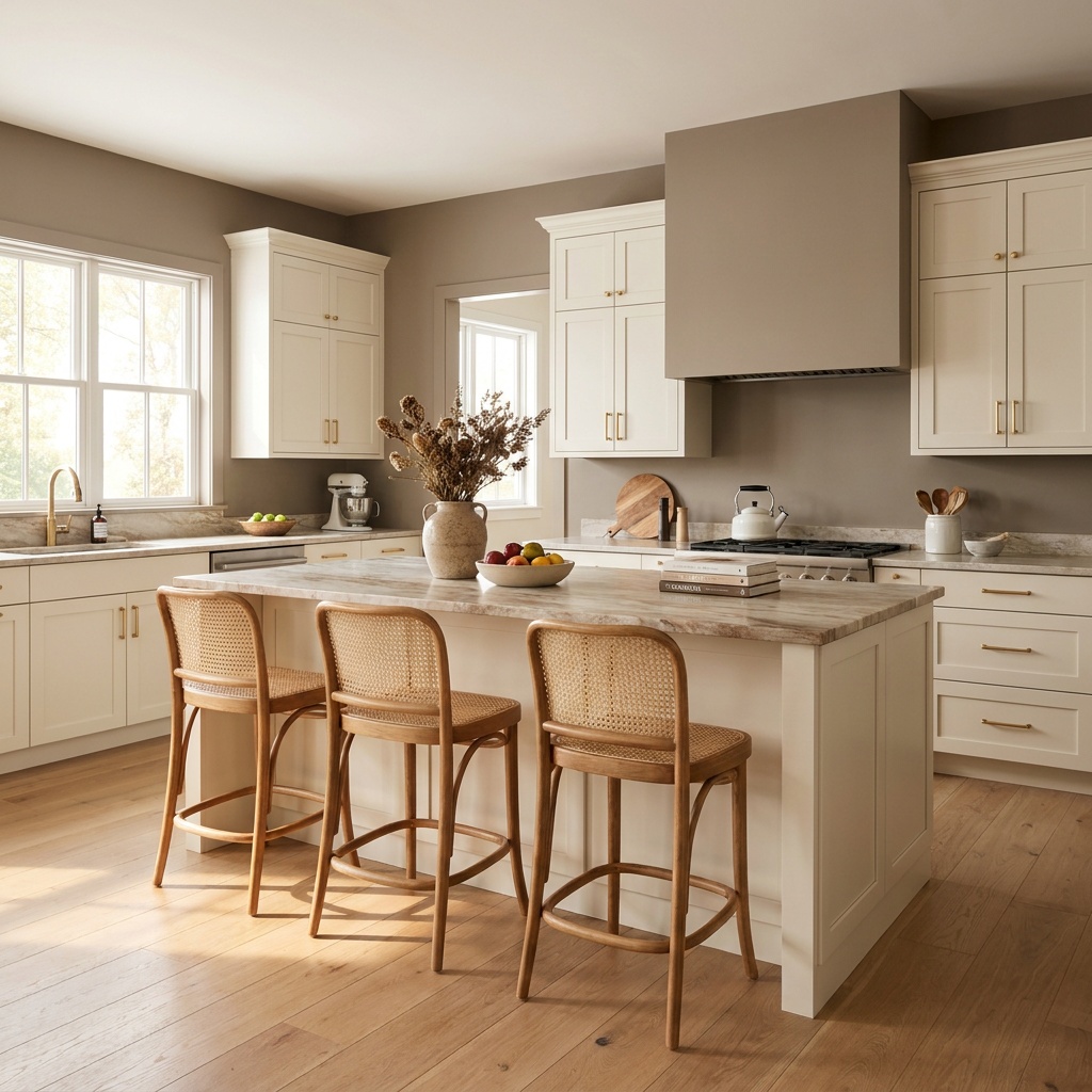
A kitchen color scheme is three decisions, not twenty. First the field color, the cabinetry and wall tone that covers roughly 60 percent of what the eye takes in. Then the surface tone, meaning counters and backsplash, at about 30 percent. Then one accent — metal, wood, or a second cabinet color — carrying the last 10 percent. Four palettes are holding up in North Atlanta kitchens in 2026: layered warm neutrals, with cream cabinetry near an 80 light reflectance value over mushroom and putty walls; earthy green, from a gray-sage around LRV 30 down to a deep olive in the teens; two-tone, warm white above and a deep color below; and warm brown, the espresso-and-charcoal family the paint industry moved to this year. All four share warm undertones. Cool gray, which ran the market for a decade, now reads flat beside warmer floors and 2700K bulbs. Choose the family first, then test the exact color in your own room.
A palette is three decisions, in order
The mistake that costs people a repaint is picking the cabinet color first, in a showroom, under lighting that exists nowhere in their house. The order that works starts with what you are not replacing: hardwood that continues into the rest of the house, a stone fireplace wall, an adjoining room already painted. Those set the undertone temperature you have to live inside. Rift-sawn white oak flooring pushes a palette warm and slightly gold; a gray-washed oak floor from 2015 pushes it cool, and it will fight a cream cabinet every day until one of them goes.
Then comes the surface tone. Counters carry more color influence than people expect, because they sit at eye level across the room and reflect light upward onto the door fronts. A stone with beige and gold movement warms a white cabinet noticeably; a cool white engineered slab makes that same cabinet look dingy. If the stone is not settled yet, our comparison of quartz, quartzite, and granite is the place to start, because the counter constrains the paint far more than the reverse.
The accent is last, and smaller than most people plan. One metal on the plumbing and pulls, one wood tone, one deeper color if you are going two-tone. Three accents competing in a room built from three values is how a kitchen ends up looking like a sample board.
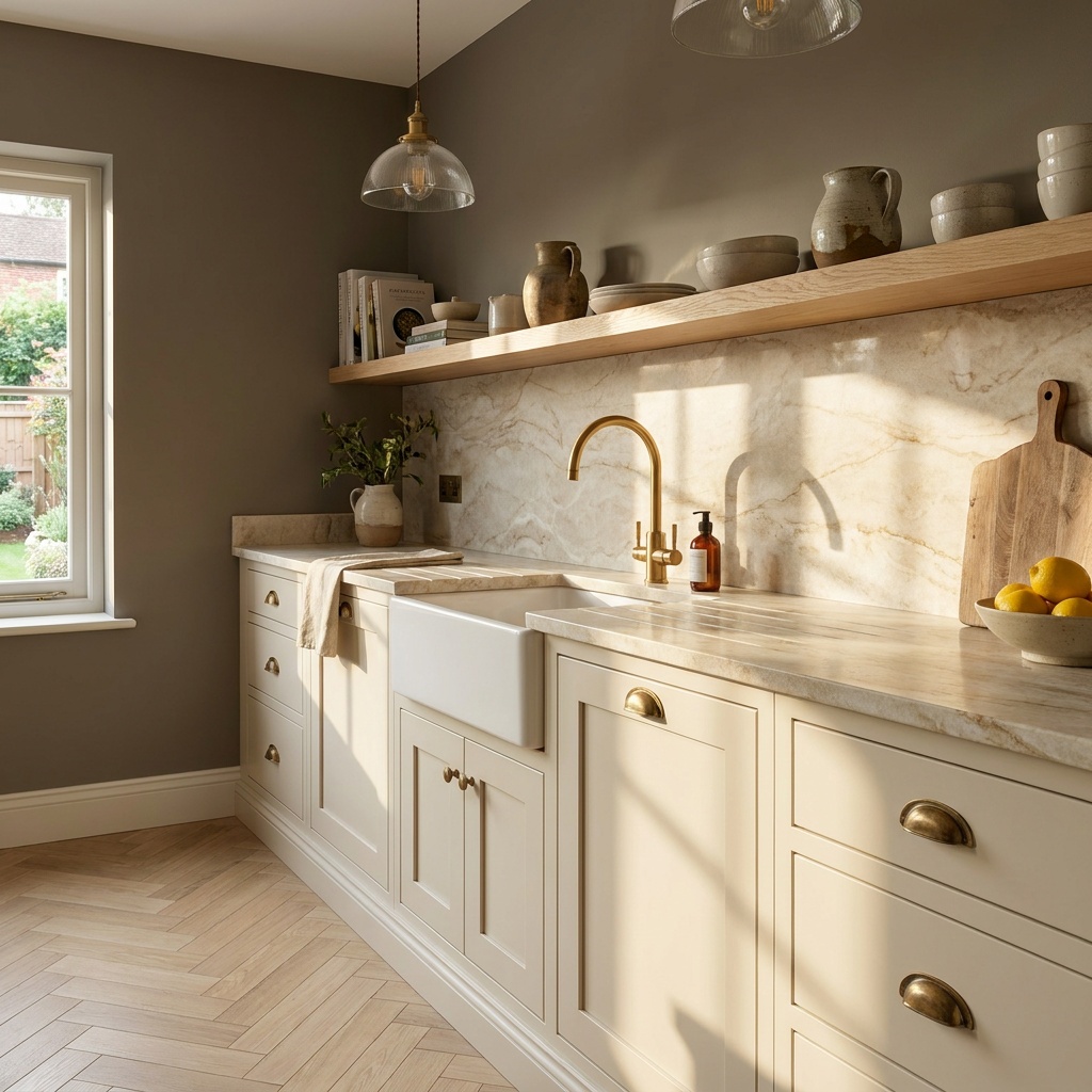
The four palettes, side by side
| Layered warm neutral | Earthy green | Two-tone | Warm brown | |
|---|---|---|---|---|
| Field color | Cream, ivory, greige, mushroom | Gray-sage to deep olive | Warm white above, color below | Espresso, walnut, coffee |
| Typical cabinet LRV | 75–88 | 12–35 | 82–90 upper, 10–30 lower | 5–15 |
| Counter that suits it | Warm-veined quartzite or quartz | Honed cream or soft taupe stone | One stone carried across both | Pale stone for contrast |
| Metal that suits it | Unlacquered or satin brass | Aged brass, oil-rubbed bronze | One finish on both levels | Brushed nickel, blackened steel |
| Best in | Any exposure; the safe commitment | Rooms with real daylight | Clear upper and lower runs | Bright, south-facing rooms |
| Main risk | Undertone drift toward yellow or pink | Goes gray and cold under cool bulbs | The color line lands in the wrong place | Shows dust and every scuff |
| Resale read | Broadest appeal | Widely liked now, more specific | Reads custom when the rule is followed | Most polarizing of the four |
Layered warm neutrals: the palette that ages slowest
This is not the all-white kitchen coming back. The version that works now uses three or four warm neutrals at different depths rather than one white everywhere: a cream or ivory cabinet in the low-to-mid 80s LRV, walls in a mushroom or putty a few steps darker, a stone with tan and gold movement, and white oak carrying the warmth at floor level.
The depth difference is what saves it. A white cabinet against a white wall against a white counter has nothing to describe itself with, so the room flattens under any single light source. Drop the walls to roughly LRV 55 and every shadow line in a paneled door starts doing work. We made the fuller case for this family in our look at warm white and ivory cabinetry.
The risk is undertone drift. Warm whites carry a yellow, a greige, or a pink-beige base, and the one you cannot see on a two-inch chip becomes obvious across 30 linear feet of door fronts. A yellow-based cream under 3000K bulbs, in a room taking green summer light through hardwood canopy, can read distinctly butter.
Earthy green, and how deep to go
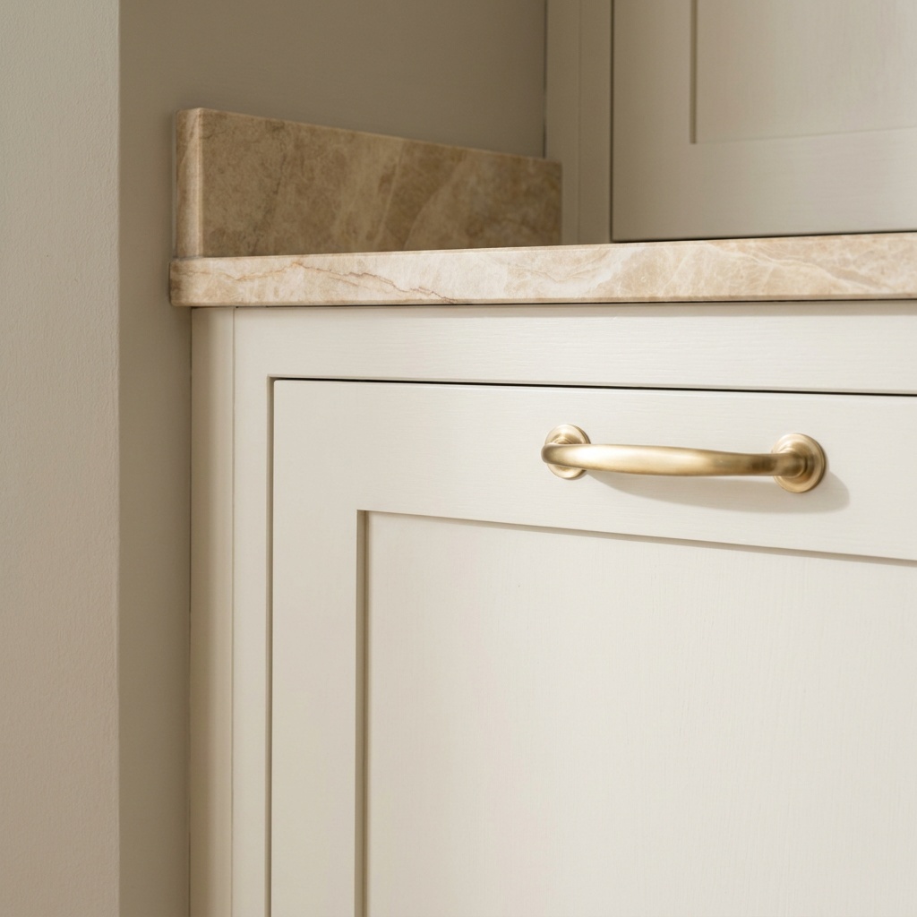
Green has moved from accent to field color and stayed long enough to stop being a risk. The useful way to think about it is depth rather than hue. A gray-sage near LRV 30 behaves almost like a neutral, sitting quietly beside cream, brass, and warm stone. Go to a deep olive or forest in the teens and you have made a statement the rest of the room has to answer.
Depth also decides where the color can go. Sage works on a full run of perimeter cabinetry without closing a room down. A deep olive on every wall cabinet in a kitchen with one window will eat the daylight, which is why deeper greens usually land on an island, a base run, or a single tall bank of pantry cabinets.
The trap with green is bulb temperature. Gray-greens hold enough blue that a 4000K bulb strips the warmth out and leaves something closer to institutional gray. Pair green cabinetry with 2700K lamps at a color rendering index of 90 or better, and light the counter from below the uppers as well as overhead — our guide to under-cabinet lighting covers the placement that makes a deep color read right.
Two-tone, with one rule
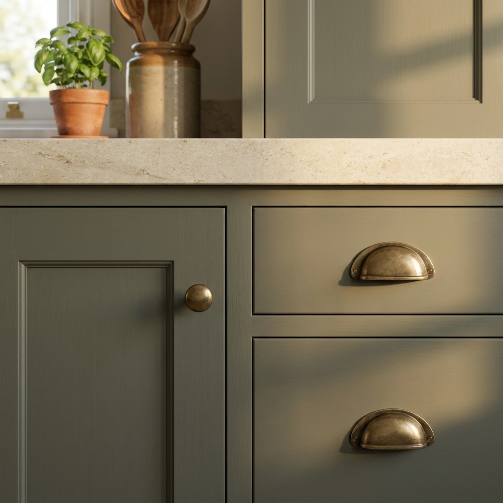
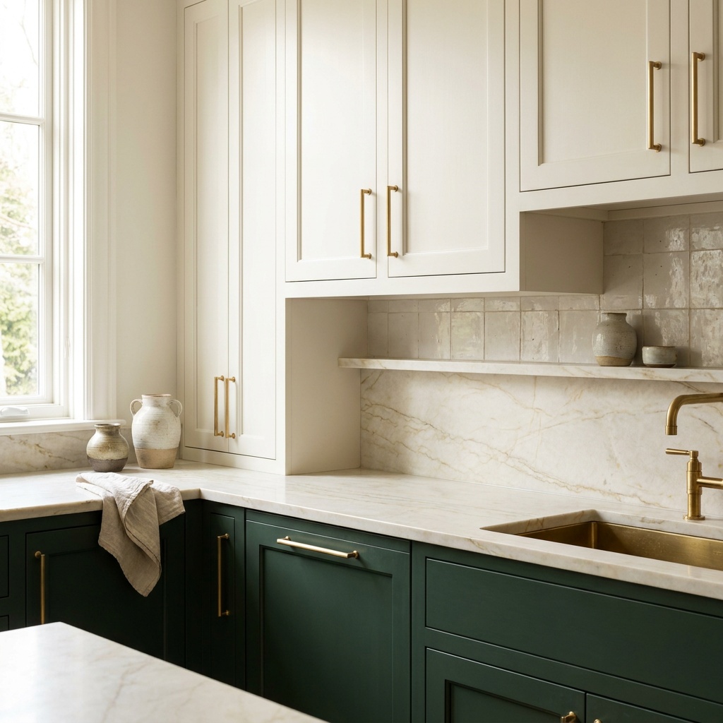
Two-tone is the strategy behind most of the kitchens people save to a design folder, and it fails for one reason: the line between the two colors lands somewhere arbitrary. The color change should follow a structural break the eye already accepts — the counter plane, the island as a freestanding piece of furniture, or a full-height wall of tall cabinets read as its own volume. Anything else looks like a job that ran out of paint.
The reliable arrangement is warm white or cream on the wall cabinets, a deeper color on the base cabinets and island, and a single stone carried across both so the counter reads as the seam rather than a third element. In kitchens with few uppers, keeping the perimeter neutral and treating the island alone as the color works better.
Hardware is where two-tone kitchens overcomplicate themselves. One metal, both levels. If the base color is dark enough that brass disappears against it, lighten the base color rather than adding a second finish. The door face matters as much as the color split, and our breakdown of shaker, slab, inset, and beaded doors explains which faces hold a deep color best.
Warm brown: the year’s real shift
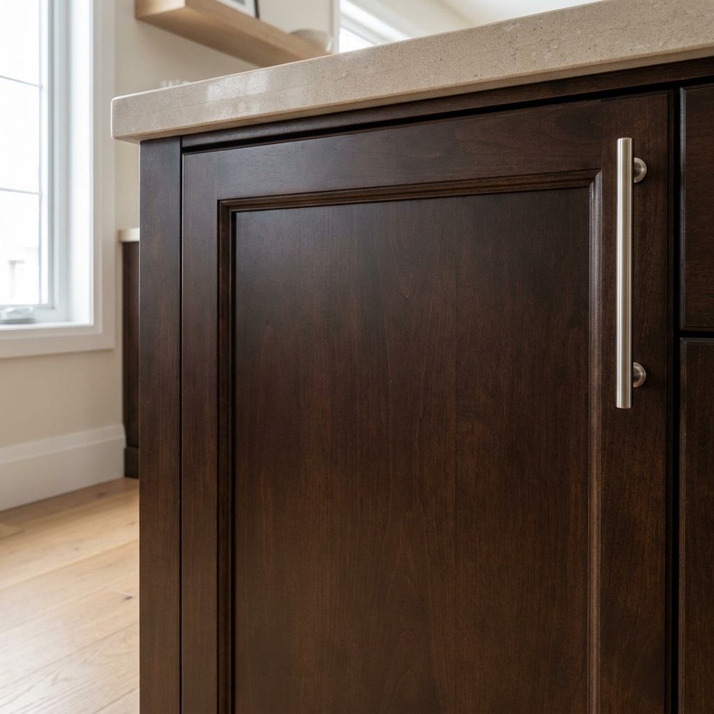
The notable move in 2026 paint releases was toward deep, warm browns — espresso with charcoal in it, coffee, and the walnut-adjacent stains that read the same way. In a kitchen this works on base cabinets, an island, or a furniture-like piece such as a hutch, set against pale walls and a light stone.
Brown also has a practical advantage over the black it is quietly replacing. A true black door shows dust, water spots, and every fingerprint along the pull, and it goes chalky if the sheen is too flat. A warm brown in satin reads nearly as deep from across the room, holds up better to daily hands, and pairs easily with white oak. It is still the most specific of these four: in a small north-facing kitchen it reads heavy by four in the afternoon.
How North Atlanta light reads paint
Orientation matters more here than the brochures suggest, for a local reason: most established neighborhoods in Alpharetta, Roswell, and Milton keep mature hardwood canopy right over the house. From late April into October that canopy filters daylight green before it reaches a window, cooling every color in the room. The same cream that looked correct in a bare model home can read faintly gray in a shaded kitchen in July.
North-facing kitchens get steady, cool, blue-leaning light all day and no direct sun, so whites with a gray or blue base turn icy there and creams and greige-based whites are the safer choice. South-facing rooms have the opposite problem: strong warm light amplifies yellow, so a butter-toned cream can tip too far while a gray-sage holds beautifully.
Artificial light closes the gap. Standardize on 2700K lamps at a CRI of 90 or better throughout the room, including inside glass-front cabinets and under the uppers, and the palette you chose at noon still reads the same at nine at night. Mixed bulb temperatures undo an otherwise careful color decision, and that is the most common reason a finished kitchen looks different from the plan.
Testing so you only choose once
Chips are for narrowing. Commit only after a real sample, using a method that takes a weekend.
- Narrow to three candidates per element, no more. Shopping past that point produces fatigue rather than accuracy.
- Paint two coats on white poster board at least 12 by 12 inches, not on the wall, so the old color underneath does not influence what you see.
- Hold each board flat against your actual counter and floor samples, then look again with it vertical, since a door front takes light differently than a counter does.
- Look at three times: morning, mid-afternoon, and after dark with only the kitchen lights on. The color that survives all three is the one.
If your cabinets are sound and only the color is dated, painting is a legitimate route rather than a compromise, as long as prep and finish are right — see what actually holds up when cabinets are repainted. If the layout is changing too, color belongs later, after cabinetry and stone are selected. Our Alpharetta kitchen remodel guide walks through that sequence, the Johns Creek page covers the same work east of the river, and our main site shows the full range of projects.
Common questions about kitchen color schemes
Are gray kitchen cabinets out of style in 2026?
Cool, blue-based grays have clearly fallen out of favor, and they date fastest next to the warmer floors and 2700K lighting most kitchens now use. Warm grays are a different matter: a greige, or a gray with a brown or green base, still reads current because it belongs to the warm neutral family. If you have existing cool gray cabinetry you otherwise like, warming everything around it does more than repainting does.
What color should the kitchen island be?
A deeper value than the perimeter, most often. The island is the one piece a kitchen reads as furniture, so color there is expected and does not need repeating anywhere else. Deep green, muted blue-green, warm brown, and stained wood all work against a cream or warm white perimeter. Carry the same countertop across both so the two colors share a seam, and keep one hardware finish throughout.
Do dark cabinets make a kitchen look smaller?
Depth on base cabinets does not shrink a room; depth above eye level does. Wall cabinets in a dark color absorb the light that would otherwise bounce down onto the counter, and the room closes in as a result. That is why two-tone works so reliably in a modest kitchen: light uppers keep the ceiling plane bright while the deep base color grounds the room. For dark cabinetry in a small kitchen, put it below the counter and light the uppers from underneath.
Still deciding between two palettes and want to see them against your own cabinets, counters, and light? Book a consultation or call 404-640-2361, and we will bring samples to your kitchen rather than asking you to judge them in a showroom.